Practical sales page guide
Call-to-action examples that explain what happens next
Write buttons around the actual next step, then check the destination.
By Business Tutorials ·
Write the destination first
Before choosing button copy, decide what happens after the click. A download, a checkout and an application form are different actions. “Get started” can hide those differences. Use the surrounding text to explain any detail that cannot fit naturally on the button.
For a free resource
“Get the free starter kit” describes the resource. Put the email requirement and follow-up information beside the form. The confirmation should tell the visitor where to find the gift and what to do if delivery fails. Do not call a paid trial a free download.
For a course purchase
“Get the workshop · €197” combines the action and price when a one-off payment is the actual offer. The checkout still needs the complete payment details and terms. Avoid “Access now” while the lessons are not available or access is not automatic.
For an enquiry
“Request a project review” is appropriate for an enquiry that requires qualification. Explain whether the request is free and whether a response is guaranteed. Do not use “Book my session” if the destination only collects an email without reserving a time.
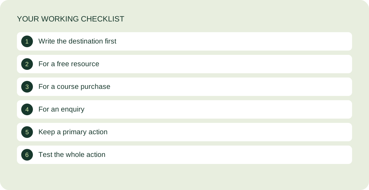
Keep a primary action
A page can repeat its main action after relevant sections. Repeating the same destination is different from competing buttons for several unrelated offers. A secondary educational link can help a cautious reader, but its visual treatment should not obscure the main decision.
Test the whole action
Check the destination on mobile, submit a designated test contact, verify delivery and confirm the next page. For checkout, use the platform’s test mode and verify member access. Button text is one part of that journey; a clear label cannot repair a broken confirmation or missing email.
Further reading: Unbounce’s explanation of calls to action. The examples and review steps above are original teaching material.
The guided video workshop is in preparation. Start with the free kit while the lessons and customer journey are being completed.
Keep working on your page
How to present your price on a sales page
Make the total, scope and payment arrangement easy to understand.
Read the guide ↗
A sales page review checklist before you publish
Check the explanation, evidence and customer journey before sending traffic.
Read the guide ↗